Citi Bike Analysis

1. Introduction
Bicycling is an activity that yields many benefits. Riders improve their health through exercise, and traffic congestion is reduced when riders move out of cars, resulting in a corresponding reduction in pollution from carbon emissions. In recent years, Bike Sharing has become popular in a growing number of cities worldwide. The NYC “CitiBike” bicycle sharing scheme went live in midtown and downtown Manhattan in 2013 and has since expanded, as measured by daily ridership and the expanding geographic footprint, incorporating an increasing number of “docking stations” as the system welcomes riders in Brooklyn, Queens, and previously unserved northern parts of Manhattan.
One problem that many bikeshare systems face is money. An increase in the number of riders who want to use the system necessitates the purchase of more bikes and their deployment to accommodate them. Heavy ridership induces wear on the bikes, requiring more frequent repairs. However, an increase in the number of trips does not necessarily translate to an increase in revenue because clever riders can avoid paying surcharges by keeping the length of each trip below a specified limit (either 30 or 45 minutes, depending on user category).
We seek to examine Citibike trip data to extract meaningful relationships and conclusions that will provide insight for executive sectors. Our findings can be categorized under three headings: usage trends, common locations, and expansion policy. In the first category, we study usage trends on multiple scales ranging from hourly to yearly. The second category is dedicated to finding geographical relationships between commonly used stations, and the last category suggests an expansion policy based on the current station density and frequency of trips made.
2. Interactive Data Visualization
One of the challenges of visualizing rich data is the static scale of figures. For a data set as huge as the one we are working with, there is useful information at different scales. To address this problem, we used an interactive visualization library called Folium. A demo of such interactive visualization can be seen here.- The top 50 stations for starting and ending.
- The trend of flow for each station, shows the number of bikes that entered and left that station, color red indicates that the number of bikes left is greater than the number of bikes that have entered. Color green indicates that the number of bikes entered is greater than the number of bikes that have left. [Demo link]
- This shows the trend of magic trips (The trips that have been done by the organization itself since no trip records were available for them). Color red indicates that the number of bikes left is greater than the number of bikes that have entered. Color green indicates that the number of bikes entered is greater than the number of bikes that have left.[Demo link]
3. Finding
3.1 Usage Trend
In the past few years, the trend of using bikes has increased. In figure 1 you can see the monthly records of the number of bikes, the number of stations, and the number of trips recorded


3.2 Stations’ Location Trends
After analyzing the trend for allocating the bike stations using figure 3 showing the location of the bike stations in 2013 and 2022, it turns out that, regardless of several potential aspects, e.g., the distribution of population and the age of people, the main factors to determine the coordinates of the stations are the Number of House Units and White-Collar Occupations. In this figure,there are two set of maps related to 2013 and 2022. from left to right, each set is representing the location of stations, location of the stations considering the house units, and location of stations by taking the White Collar Occupations into account, respectively. It is obvious that increasing the number of stations from Manhattan to the north and east is a solution to deal with the heavy traffic and rush hours in New York by encouraging people to use bikes instead of private cars and even other types of public transportation. Accordingly, it is reasonable that the number of bikes used on each day of the week is similar to the other weekdays as a large number of the trips have been devoted to commuting to work. Another interesting point is that the number of new stations and the area they are covering is suddenly boosted in 2020 which is the year that the pandemic started (This fact can be confirmed by Phase 3 of the Major Citibike Expansion [link]. In this regard, it is safe to say that the pandemic was a fortune for the authorities to improve the infrastructures faster and increase the number of stations and cover more areas including Queens and a part of Bronx.3.3 Effect of Pandemic
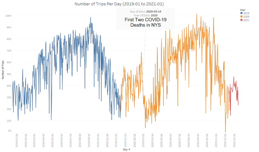
From figure 4, which shows the number of trips per day from January 1st, 2019 to January 1st, 2021, it is clear that the general pattern in 2020 is almost the same as in 2019, except for a period of time between March 14th and April 30th, 2020, due to the increasing number of deaths caused by Covid-19. Additionally, another study published in June 2021 confirms the fact that the usage of Citibikes recovered very fast, even during the peaks of the pandemic, in comparison with other types of public transportation such as the subway (Wang 2021 [15]). The reason is not surprising, as during the pandemic, people preferred to commute alone for the sake of safety, rather than being on a bus with other people.
3.4 Commonly Used Locations
In figure 5, maps are shown indicating the top 50 most frequently used starting and ending stations in 2021. As can be seen, all of them are located in Manhattan, although there are stations in other areas such as Queens, just to name a few. The information obtained from these maps has been used in the next subsection to demonstrate interesting discoveries.3.5 Proposed Expansion Policy
The expansion of bike stations was from Manhattan to the north and east to cover more areas. However, in this section, a visualization analysis for expanding bike stations to support the most used stations is proposed. By putting Figure figure 5 into a heat map illustrating the density of stations in different areas of New York and zooming in, it can be seen that a number of commonly used stations are located in areas where there are not enough stations. In this regard, these areas have the potential to have more stations and, as a result, more bikes (see [Demo]).4. Conclusion
In conclusion, we can say that there is indeed a wealth of information within this dataset, much of which has yet to be explored. In our study, which was performed within the scope of a graduate-level course, we found the following:- The number of active bikes and stations has seen constant growth throughout these 103 months of data collection, with an exceptionally fast rate in 2020.
- The number of trips made follows a seasonal trend in which more trips are made during warm seasons, in contrast to cold seasons.
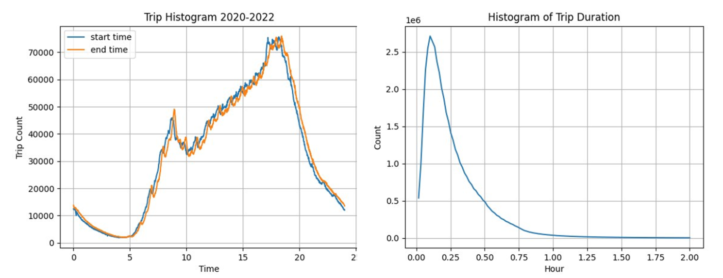
- Most trips start and end within the traffic rush hours, meaning that this bike-sharing system is used as a solution for NYC traffic congestion.
- Most trips take more than 15 minutes, while a standard ride is expected to be 30 minutes according to the company's policy. This suggests that administrators can adjust the trip standard duration to further increase overall profitability. This also indicates a need for more flexible usage plans for customers who use these bikes for a longer duration.
- These bikes are used similarly throughout the week, which means that the maintenance schedule should be adjusted to other factors such as traffic congestion on streets rather than bike usage in general.
- The network expansion policy is correlated with housing unit density and office locations.
- Although the pandemic imposed a radical drop in the number of trips made in 2020, bikeshare has recovered its usual trend, whereas many public transportation systems still lack safety standards.
- Commonly used stations are located within the financial district of Manhattan.
- The most used trip is a path around Central Park.
- Stations that are in the central region of Manhattan sink (bikes end up there), while the stations in the western area of Queens are a source (bikes start from there).
- Bikes are relocated via network admins for allocation purposes as well as maintenance.
- Bike relocations follow the reversed trend in terms of allocation compared to usual trips.
- Interactive visualization recovers some information that is hidden with static visualization.